Challenge: United Airlines had data everywhere to a point that it was overwhelming their operations team. The company, drowning in data, was being impacted by two factors that needed a design solution for. They were either missing key indicators for customer or operational impacts until it had creating significant cascading effects, and secondly they were struggling to understand what the root cause of the issue was to quickly respond. United needed to align on a single platform design for all operational groups to consume and respond efficaciously.
A second (parallel) BI effort was also underway that had similar attributes in awareness on flight delays. Field teams would report IT issues that caused operational delays that IT services struggled to validate the source and visualize deltas to operational best practices for on-time departures.
Approach:
There were six operational verticals across a global footprint from flight teams, airport teams, station ops to network (global) operational teams, all with divisions that had This was a highly complex project that was attempted several times in the past by various teams. Those outcomes only went as far as quasi-modified analytical displays that never tied together various sources. During early analysis, I realized that ultimately the customer impact was what was missing in each display which contradicted the dedication to the customer experience the company had renewed under leadership.
1. Stakeholder meetings
2. Competitive Analysis
3. Current Data Heuristics (Spotfire, GA and other BI platforms)
4. Define and align common customer journey to baseline data requirements
5. Rapidly ideate in workshops in various teams
6. Prototype and validate with user sessions
7. Leadership presentation
8. Requirements and gap analysis
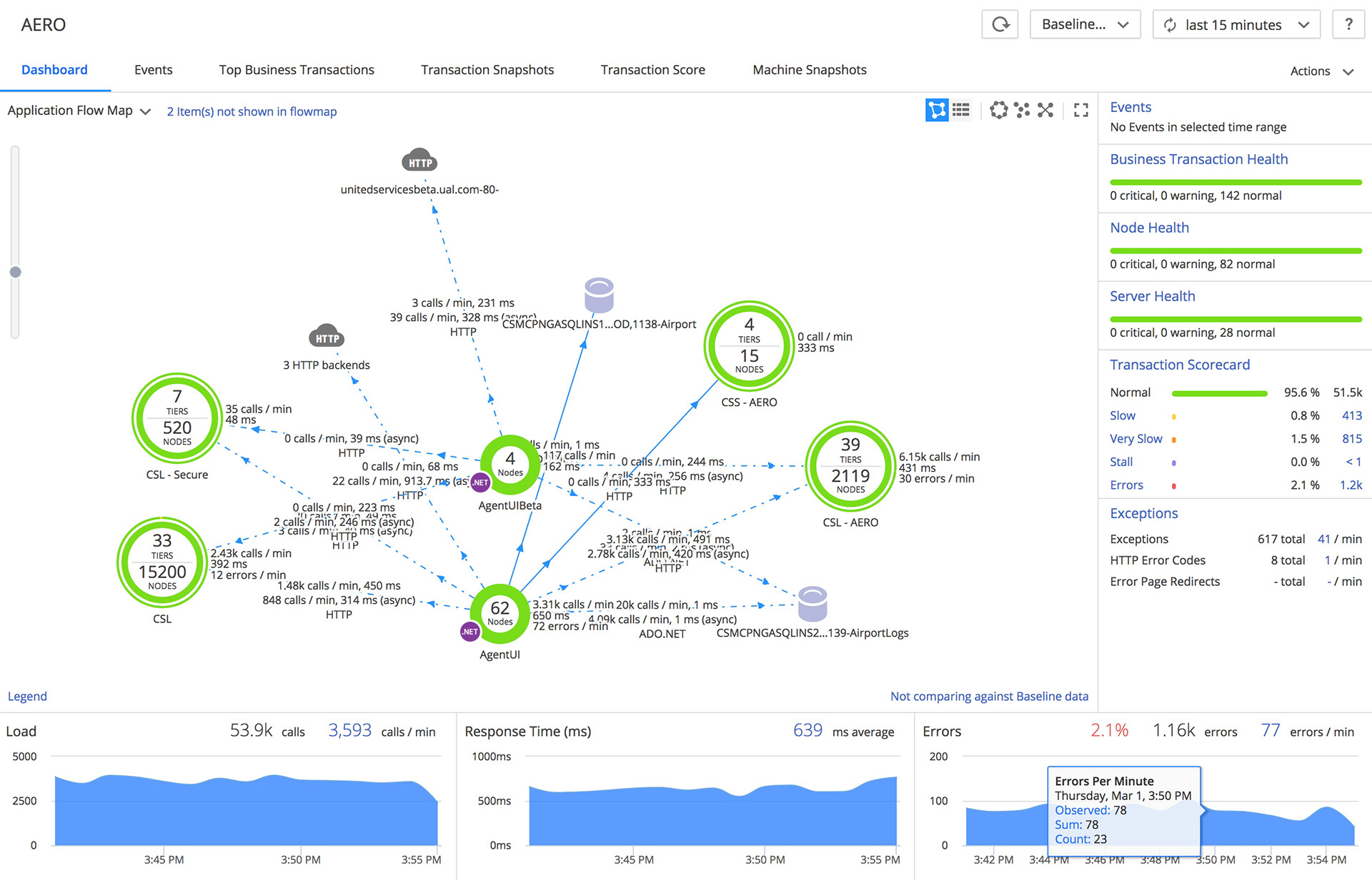
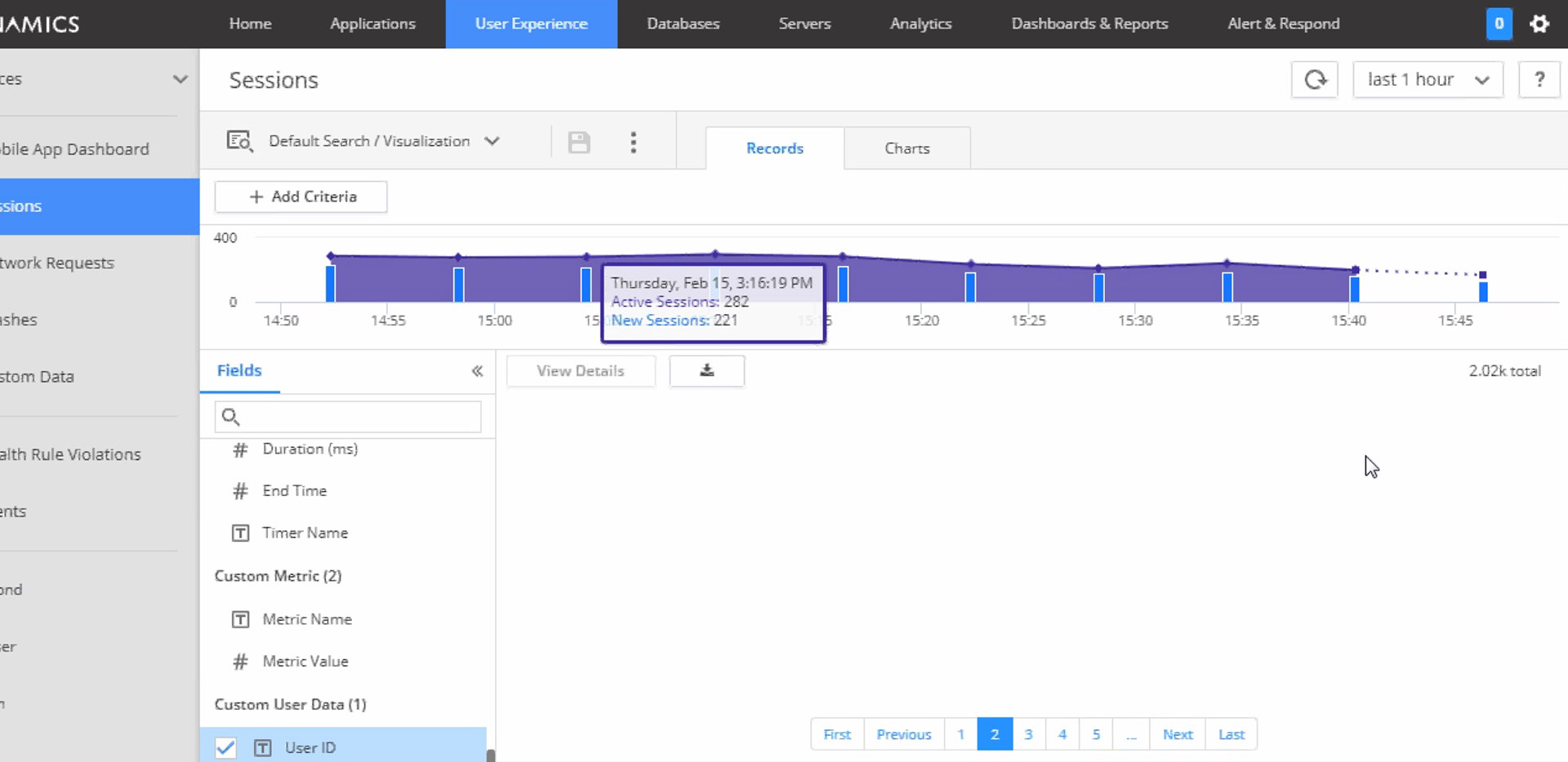
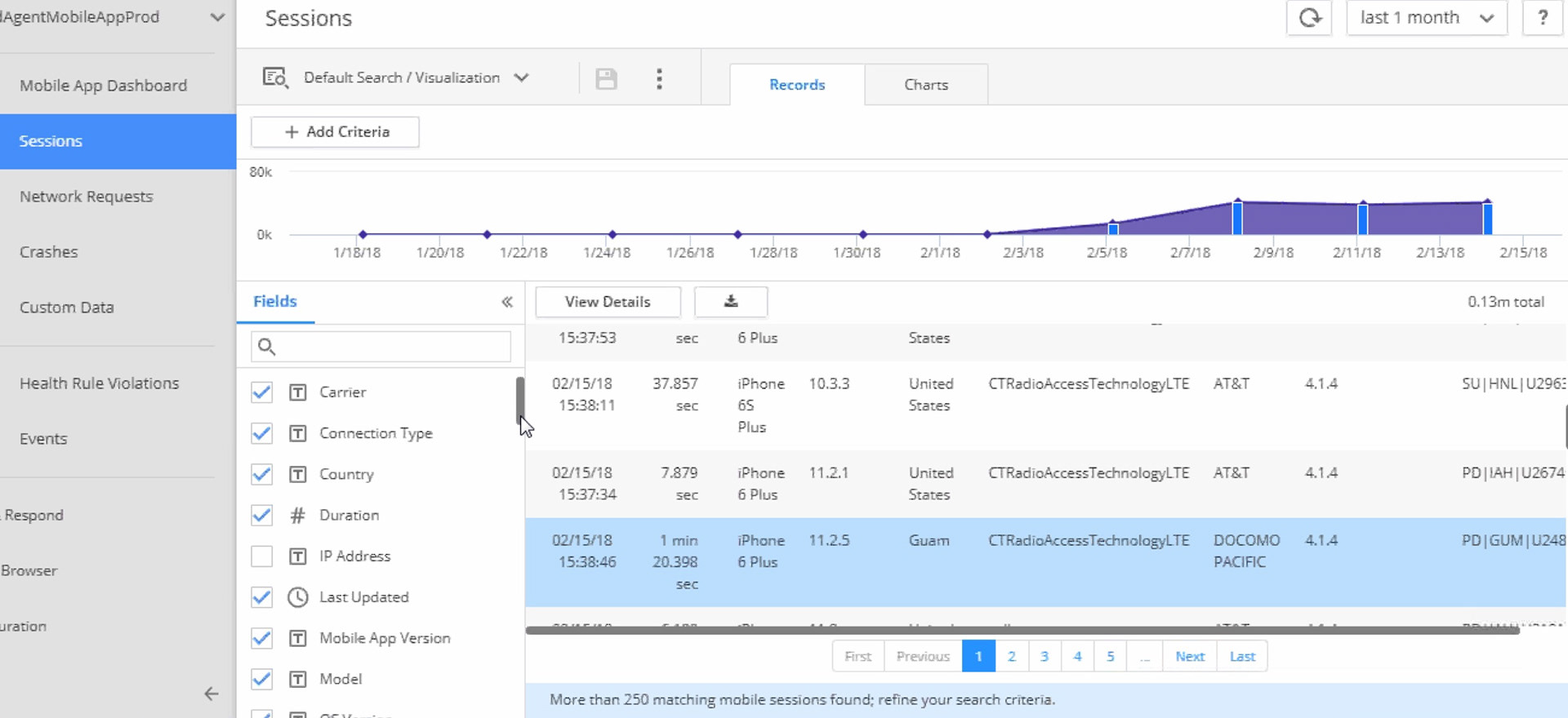
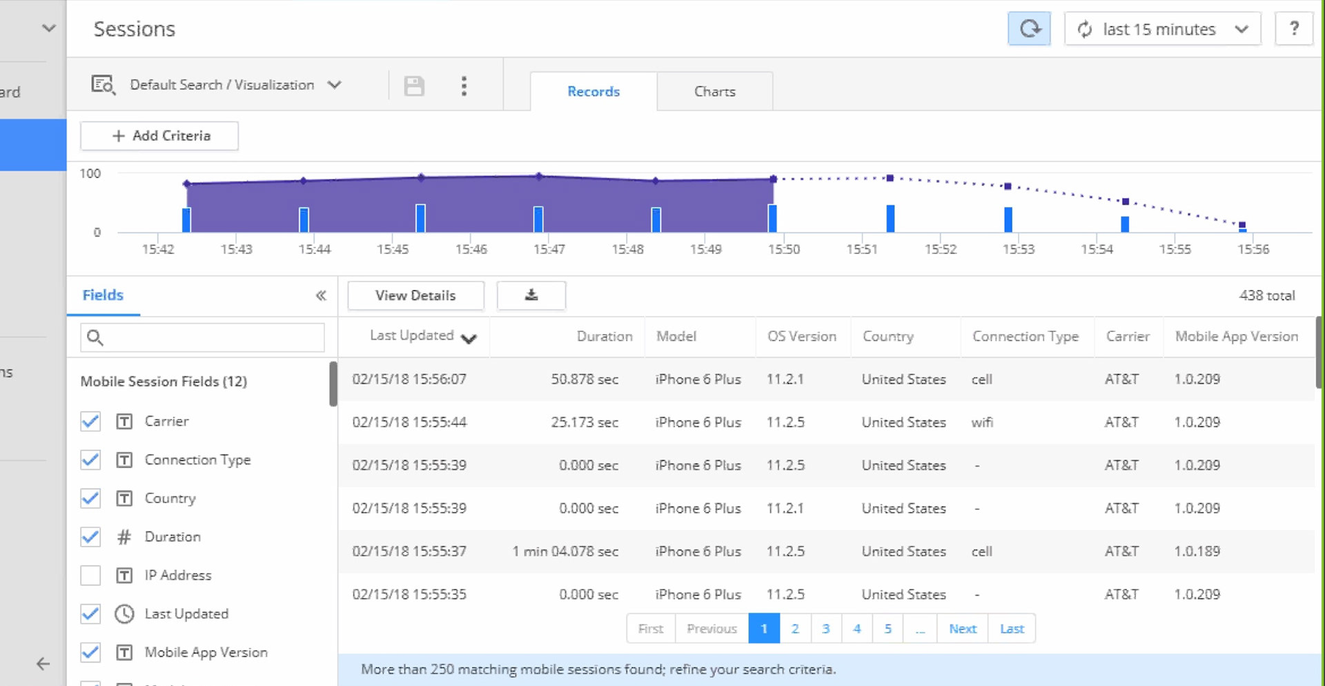
Examples of dashboards captured from various BI supplier toolsets.

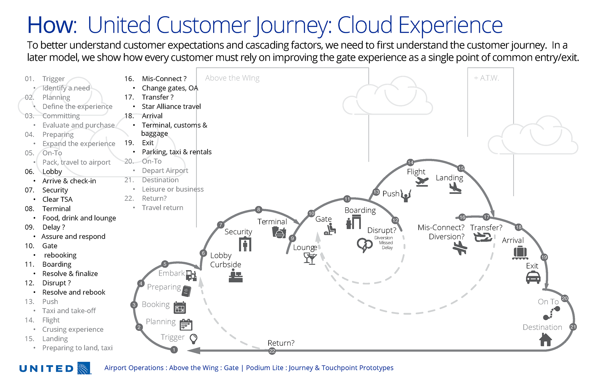
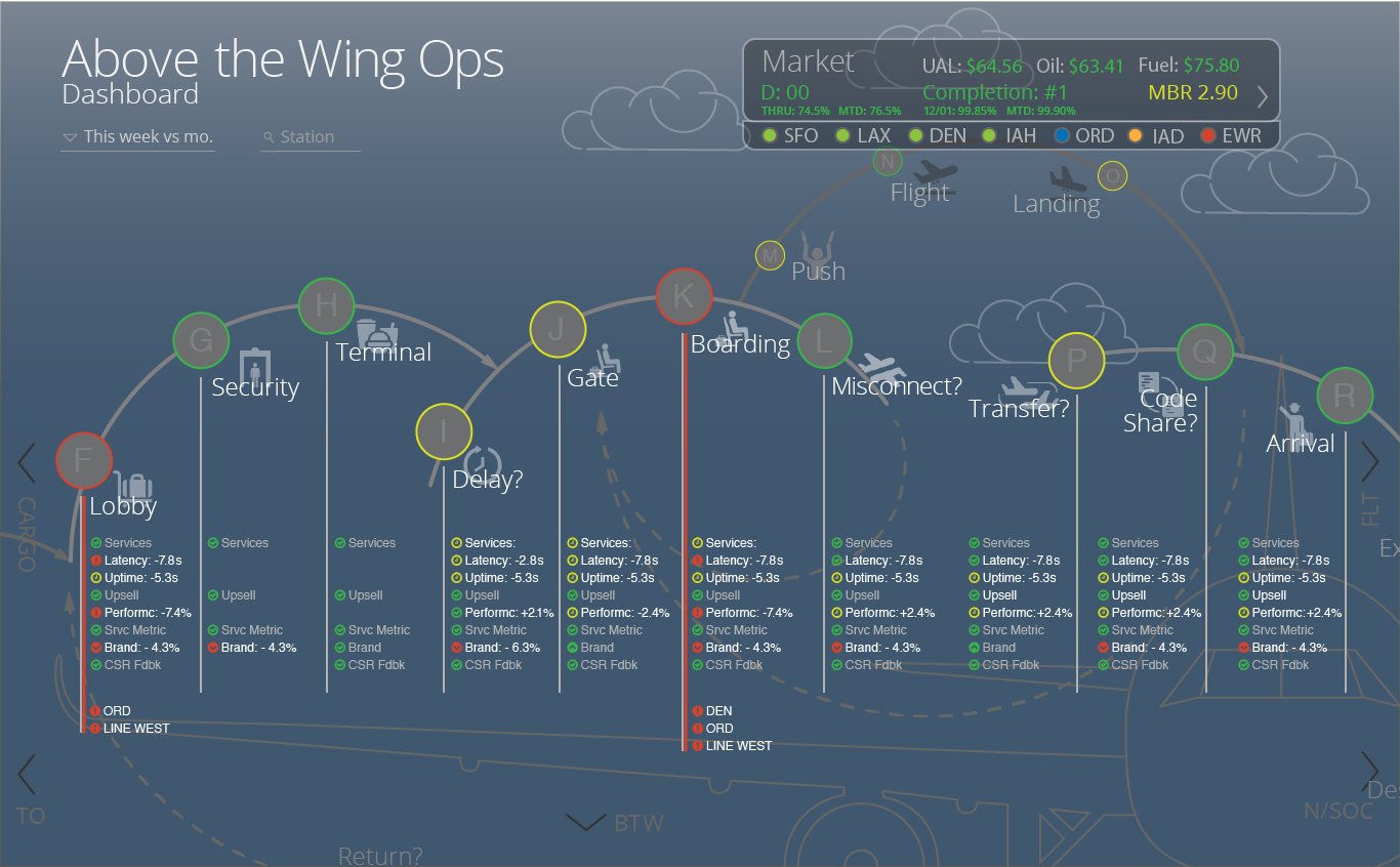
Although various business verticals required specific requirements, alignment to common data narratives and taxonomy structures needed to be achieved in order to solve for complex challenges across these teams. Below is the customer journey map that was socialized across the organization. This structure allowed us to
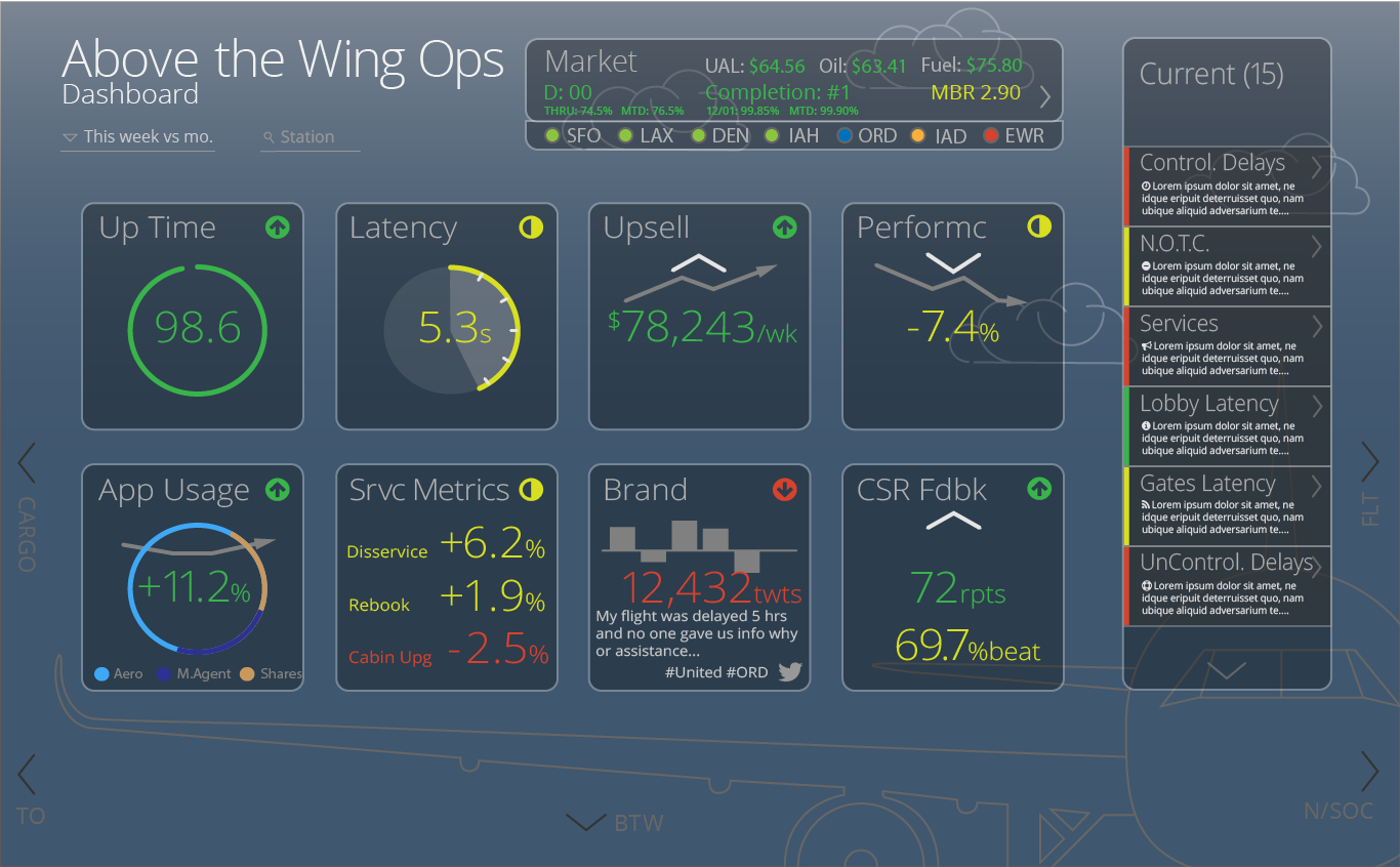
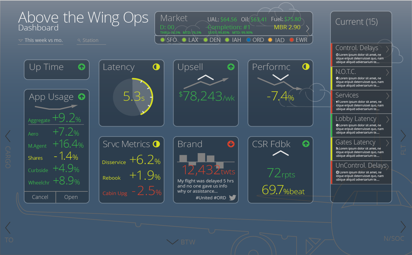
Deliverable: Several prototypes with both static and live data to begin a gap analysis and user story requirements.
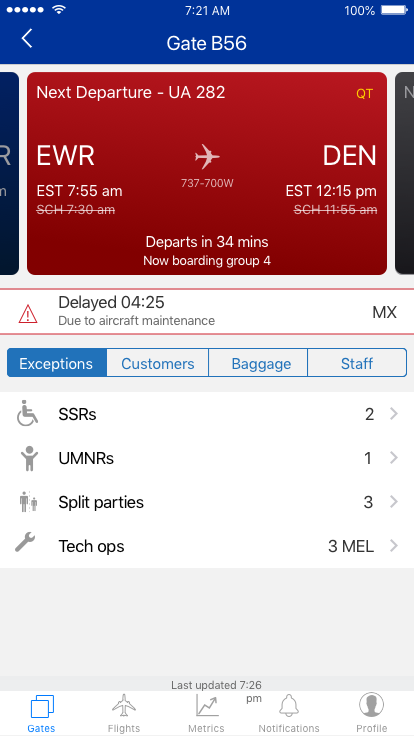
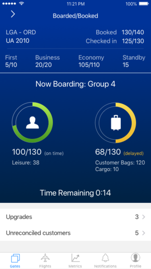
Examples of how data relationships would cascade to field team mobile tools to respond promptly and effectively.
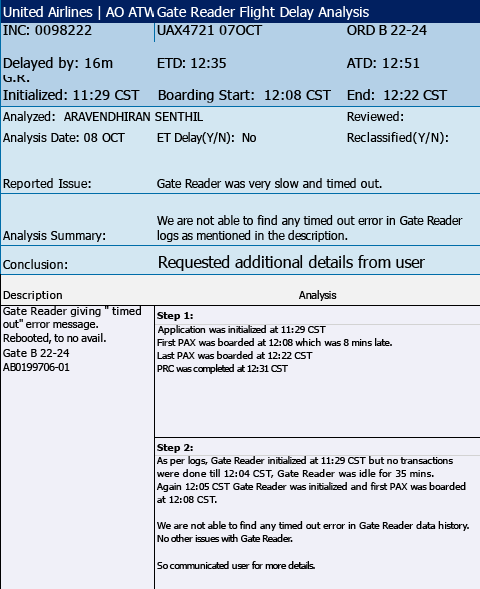
Example of early re-formatted excel data tables that are generated from front-line team error reports of a flight delay analysis.
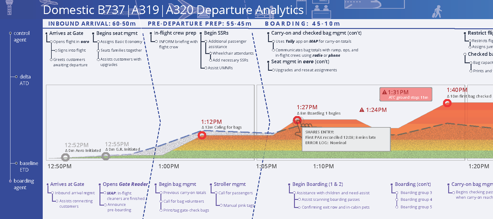
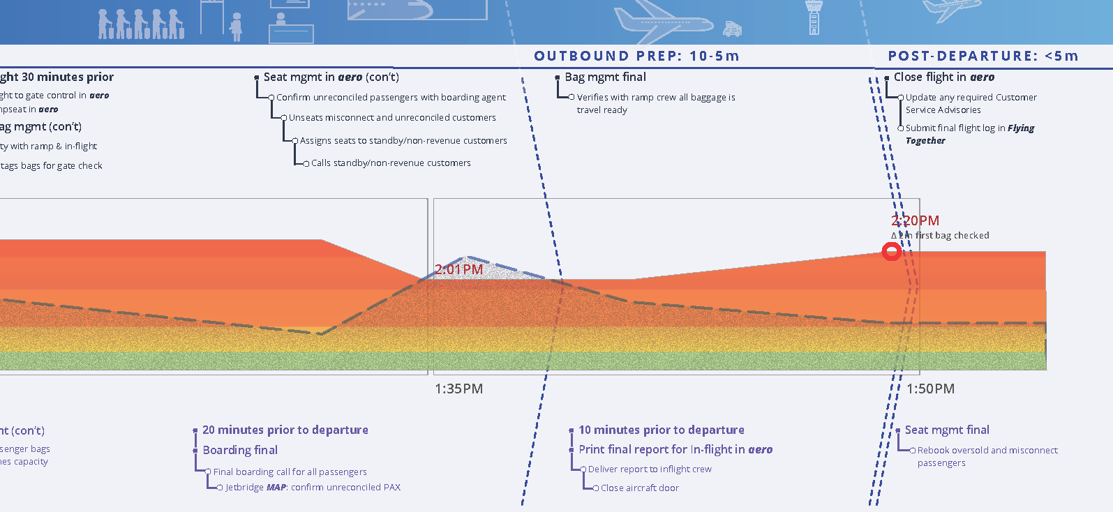
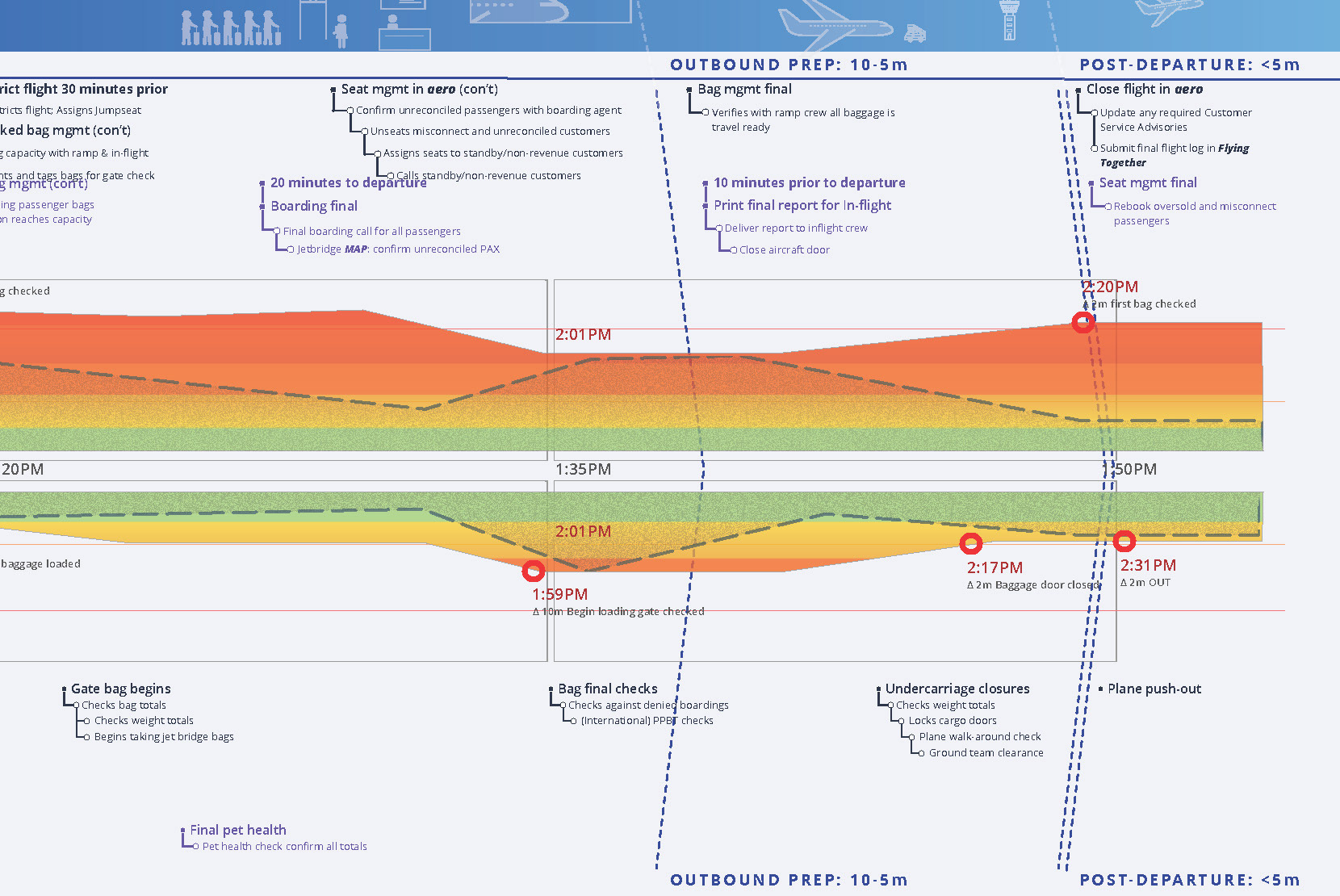
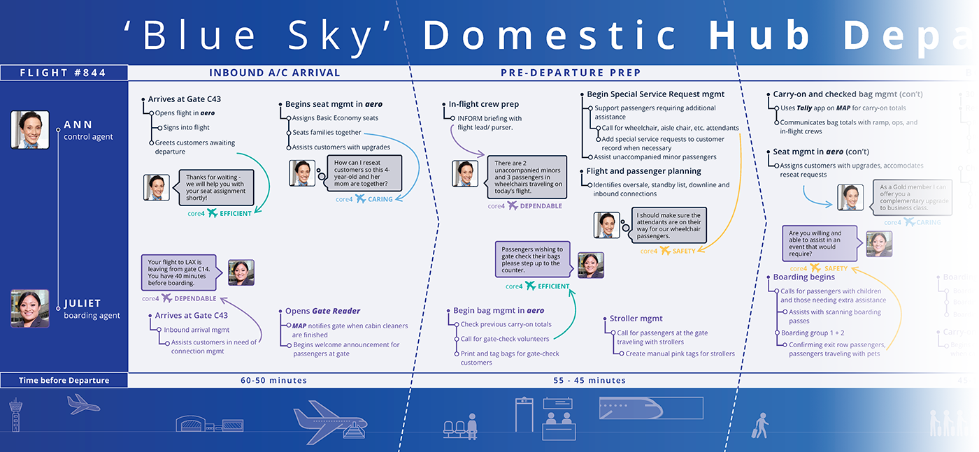
Illustrated Journey Map documentation of best practices in flight management.
Below deliverable is in two segments that represents temporal deltas between target and actual metrics of task completion including hover states of data logging that reflects system error factors against in-flight (human) errors.